Project scope UX Research and Mobile App UI
Tools Figma | Adobe Illustrator | Mural | Miró | Google Forms
Role UX and UI Designer
Duration 5 Months
SUPERVISOR Danilo Capelli
Tools Figma | Adobe Illustrator | Mural | Miró | Google Forms
Role UX and UI Designer
Duration 5 Months
SUPERVISOR Danilo Capelli
ABOUT THIS PROJECT
I developed this project during the "UX Designer Full Stack" course taught by Danilo Capelli at the SDI Academy in 2022. In this UX case study, I explore the research and design of a personal finance tool that addresses the prevalent issues users face in managing their finances. Through thorough research and user testing, I have identified the pain points and requirements of the target audience and have created a solution that is user-friendly, efficient, and accessible. This case study outlines the process I followed to design and develop the personal finance tool to improve users' financial management experience.
I executed this project in four stages: discover, ideate, prototyping and testing, and the final stage: interface design.
First stage: DIscover (Empathize and define)
Saturate and Group
The first step for this project was to collect the most significant number of impressions or experiences that users have had regarding personal finances. I conducted interviews to determine their real needs and knowledge levels. To gather the information, I implemented an empathy map canvas to understand better the insights collected.
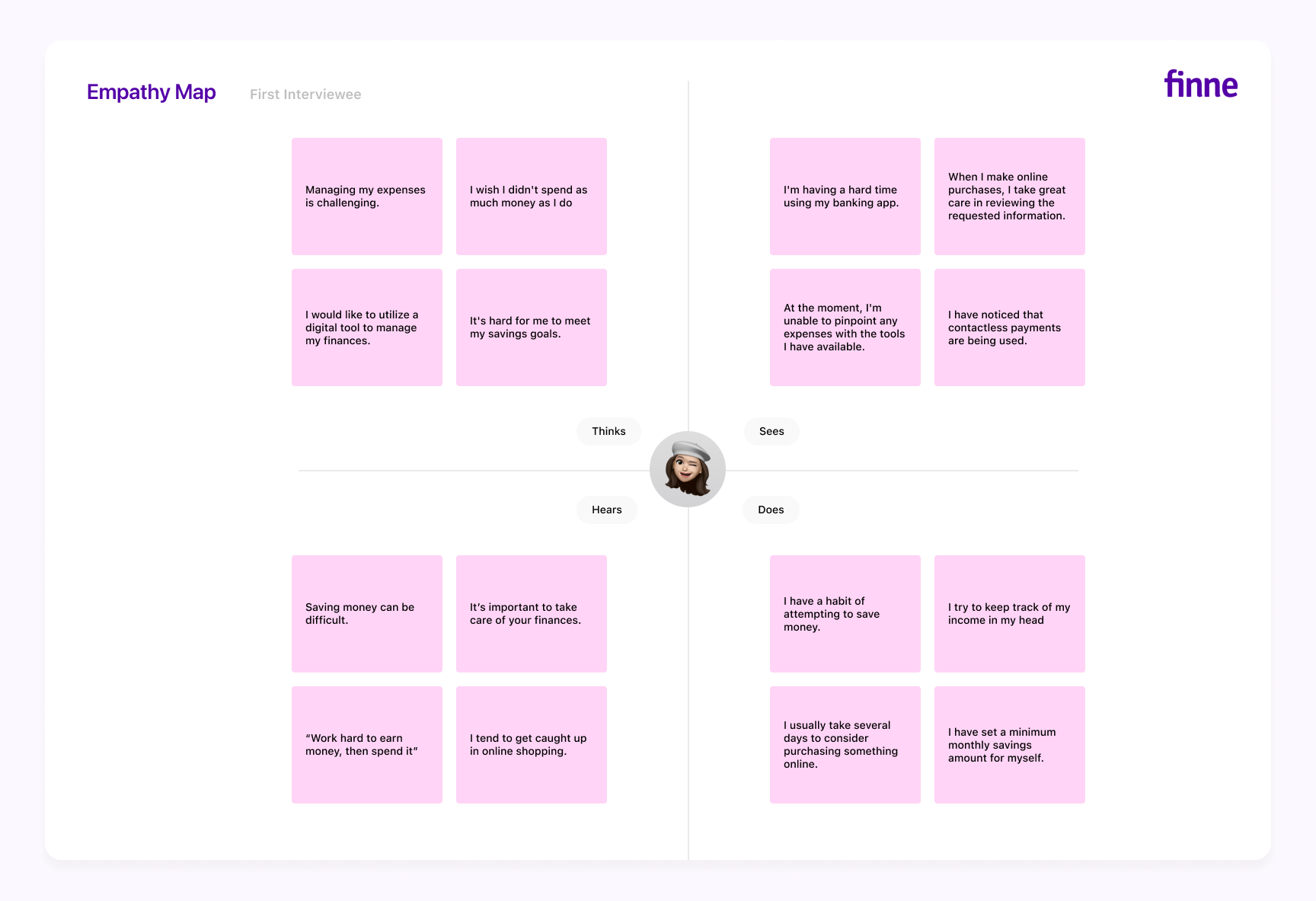
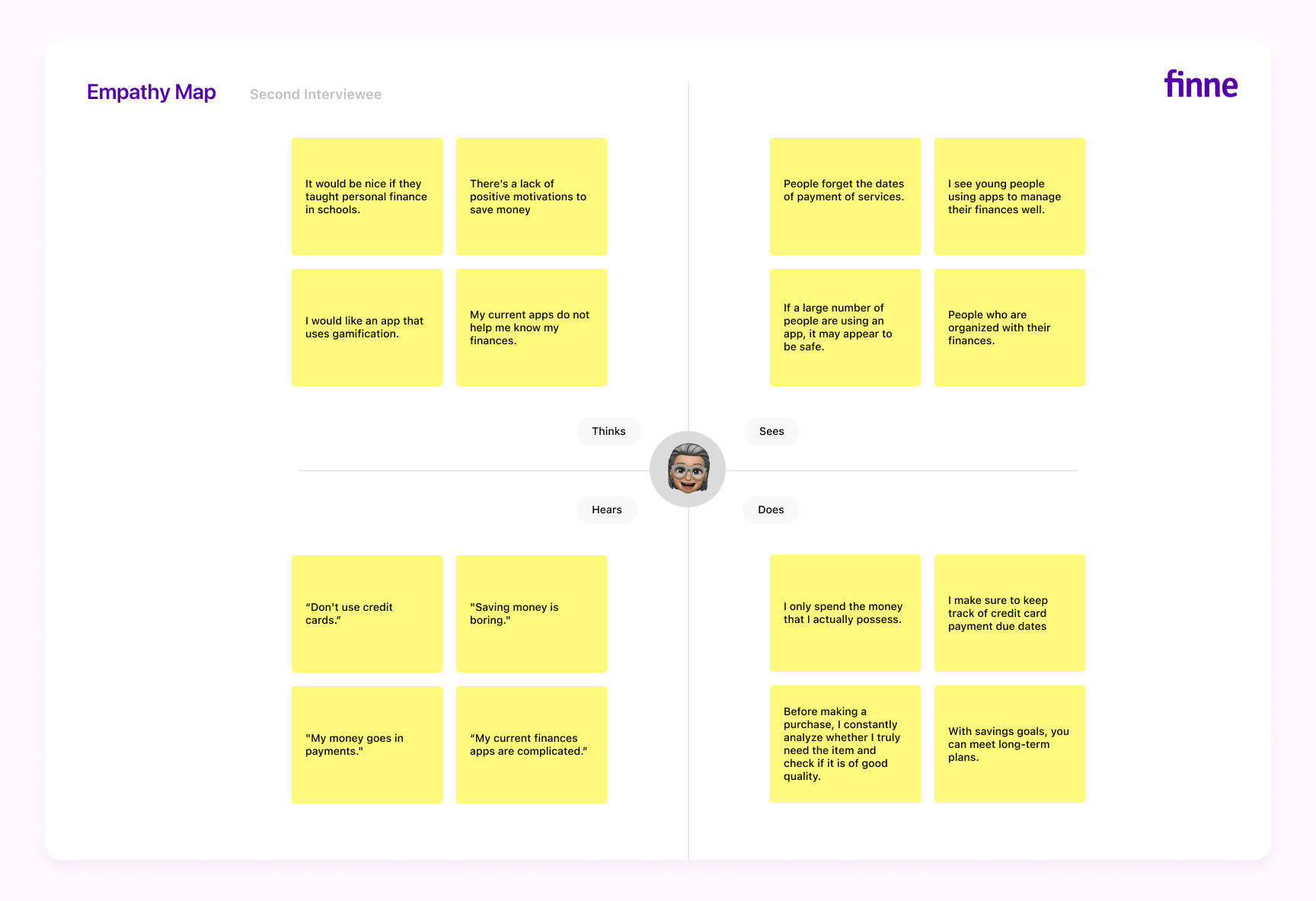
Next, I classified the information into different categories to identify objectives, needs, mental models, fears, previous experiences, and tools they currently use to find patterns of practices and real needs.
After conducting this exercise, I identified two vulnerable female profiles regarding personal finances: first-time mothers with low incomes and young people without stable jobs. Based on these findings, I formulated the initial hypothesis for this project:
First hypothesis
"How can discipline and savings tools be improved to control expenses and promote healthy financial habits?"
Stakeholders map
The next step was to implement a map of stakeholders to recognize the people, context, and spaces surrounding these users (the first-time mothers with low incomes and young people without stable jobs) to involve them in this process and consider them so that they form part of the solution of this project.
After the exercise, I identified several user profiles, including university students without stable jobs, family members such as teenage sons or daughters, and new mothers with maintenance income. I found these users have a beginner level of knowledge about personal finance. On the other hand, other user profiles included are relatives with experience in personal finance and were assigned an advanced level of expertise in this area. For instance, these users could be mothers or fathers with experience managing household finances who wanted to teach their daughters and sons about healthy personal finance habits.
User profiling
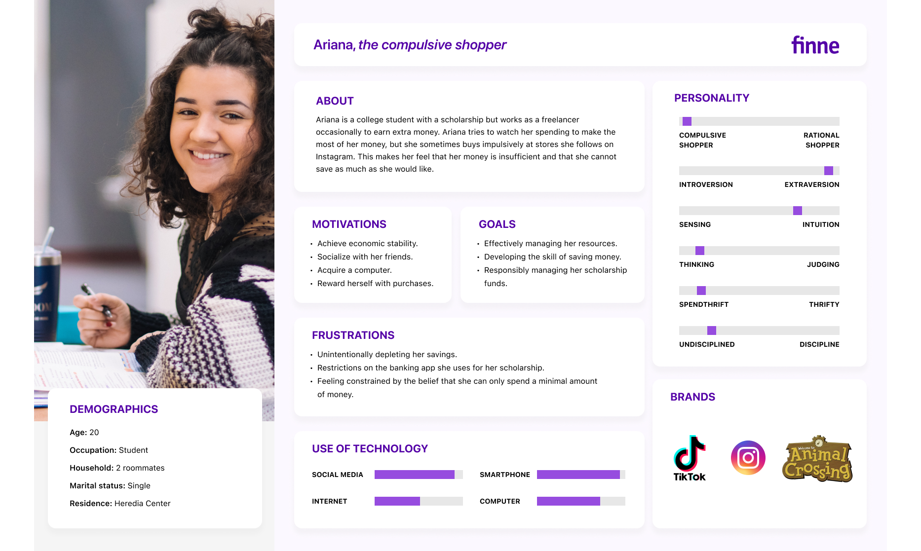
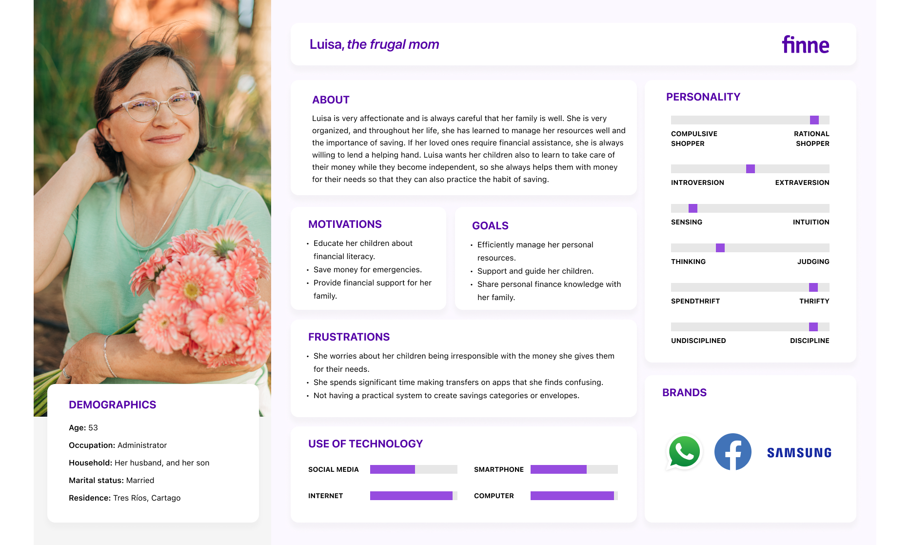
Once I identified the possible users for this research, I created three user persona profiles considering demographic information, motivations, objectives, frustrations, personality characteristics, use of technology, and brands used in their day-to-day lives.
The first user persona I developed was Nicole, a new mom with the support of her family and her baby's father, who needs to manage her money carefully to support her baby and save for the future.
The second user persona is Ariana. She is a university student with a scholarship and assistance practice that helps her earn money while she studies. Additionally, she takes on various short-term jobs to make extra money.
The last user persona I made is Luisa, an experienced mom interested in teaching her children how to manage their money well and learn to save.
Scenario mapping: User
Journey Map
Journey Map
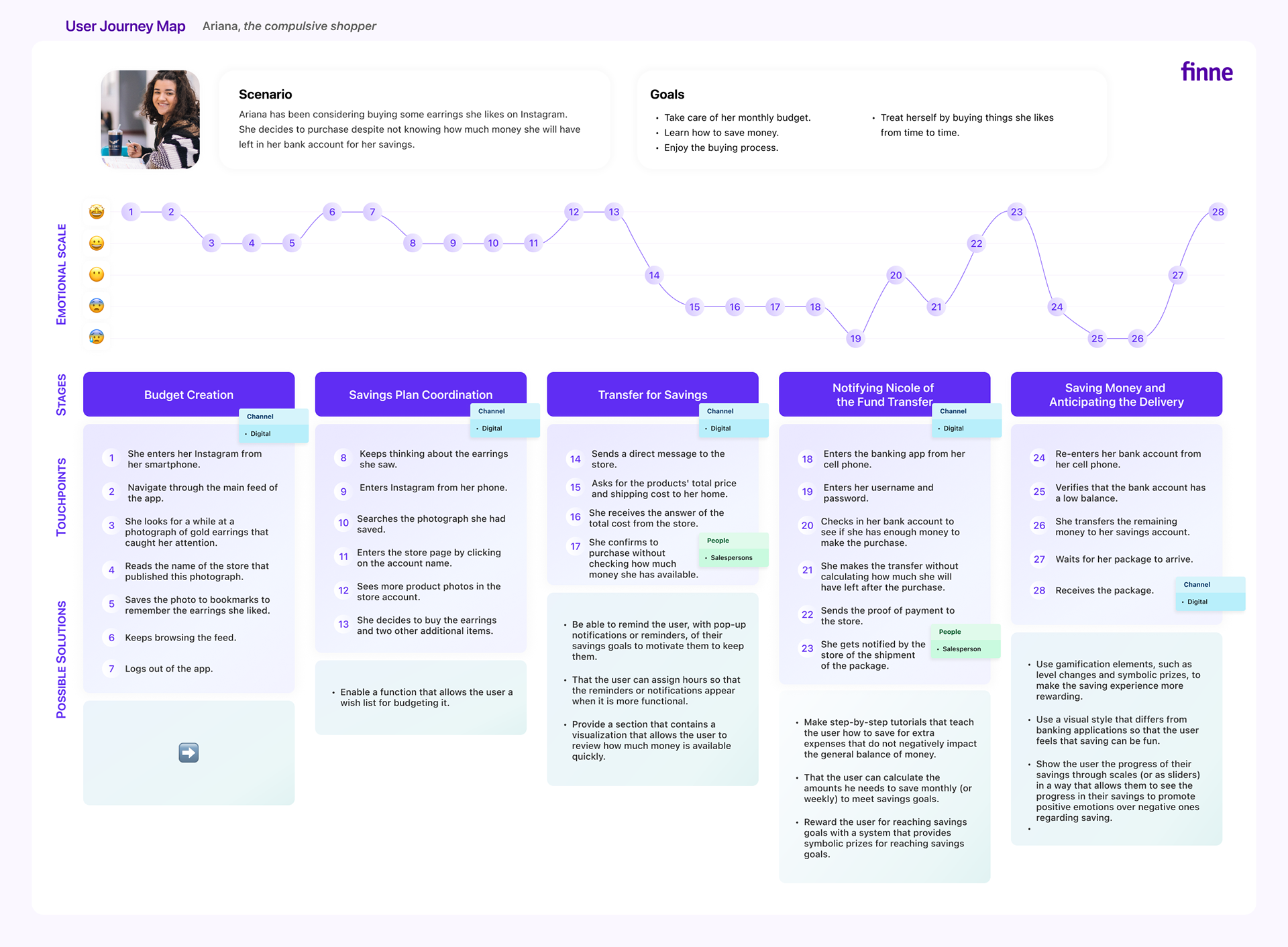
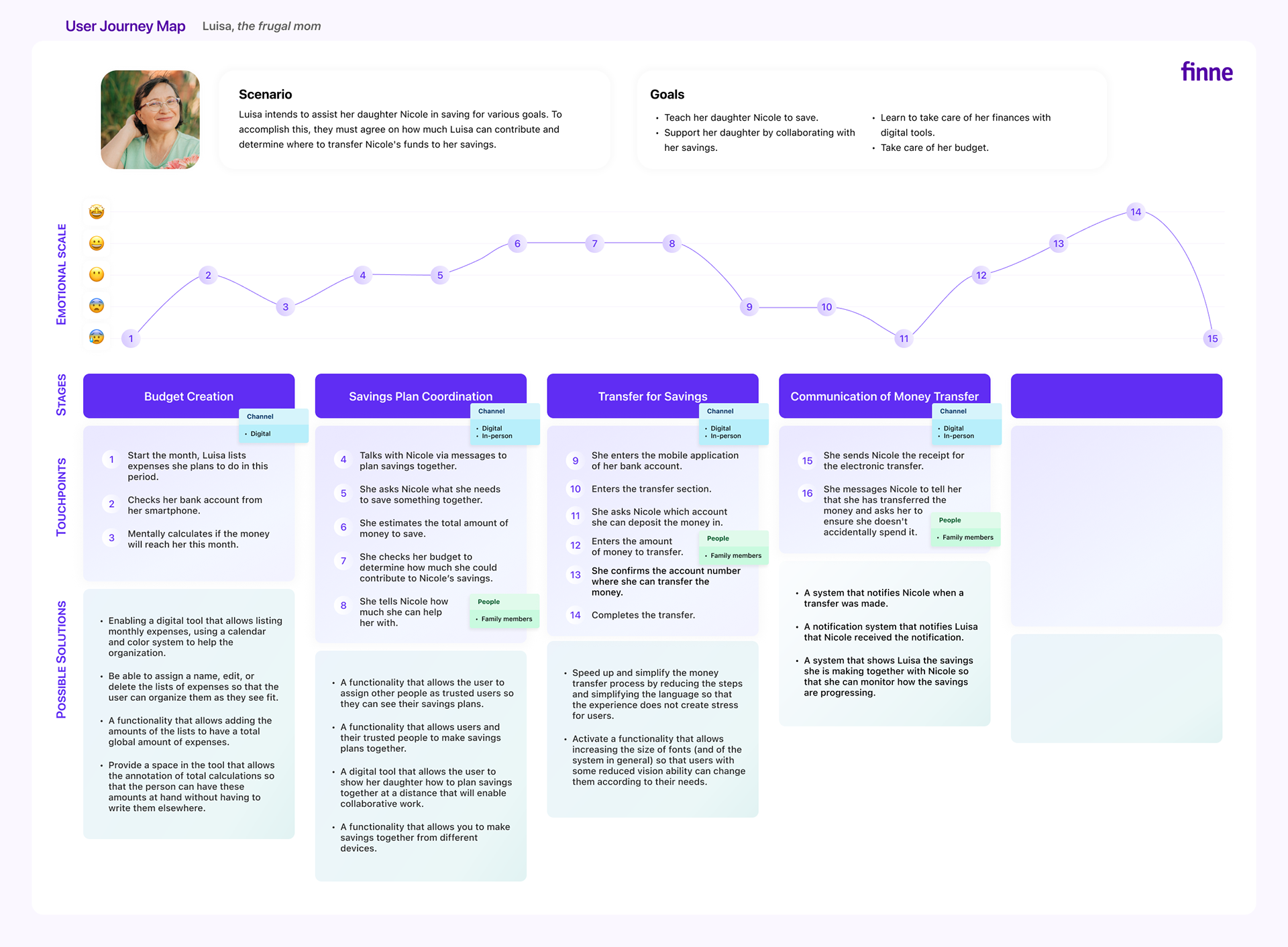
To understand the current personal finance experience of the user personas I created, I developed three maps to identify possible solutions for their everyday experiences.
After analyzing Nicole's map, I discovered she needs help tracking her monthly expenses and potential savings.
With Ariana, I found that she tends to overspend, and the apps she currently uses need to provide more insight into her financial situation and help her learn to save.
Lastly, upon examining Luisa's map, I realized that she requires a way to share financial information with her children, including how much money they need, and also be able to track their bank account details for each one.
prioritizing the possible solutions
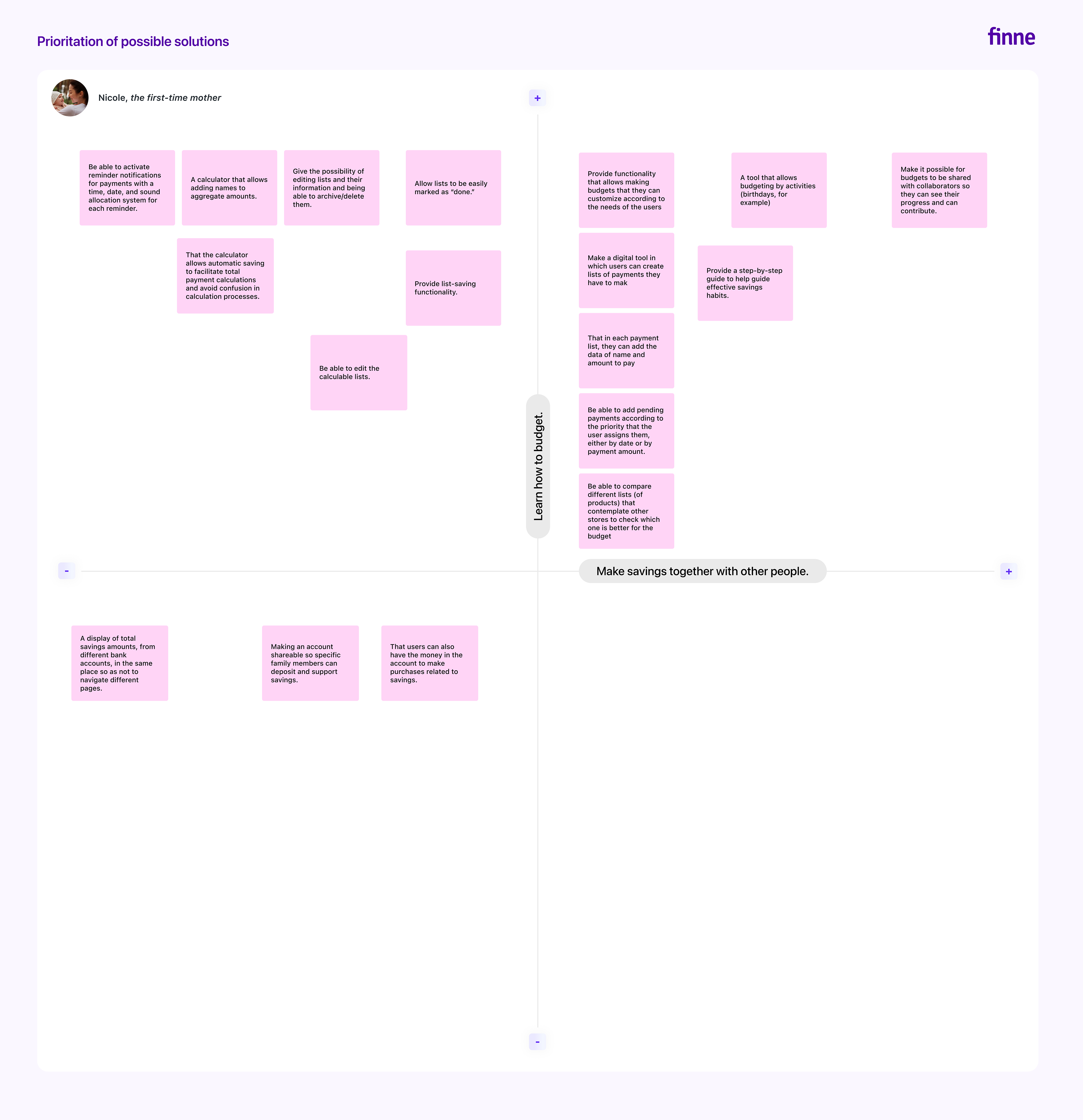
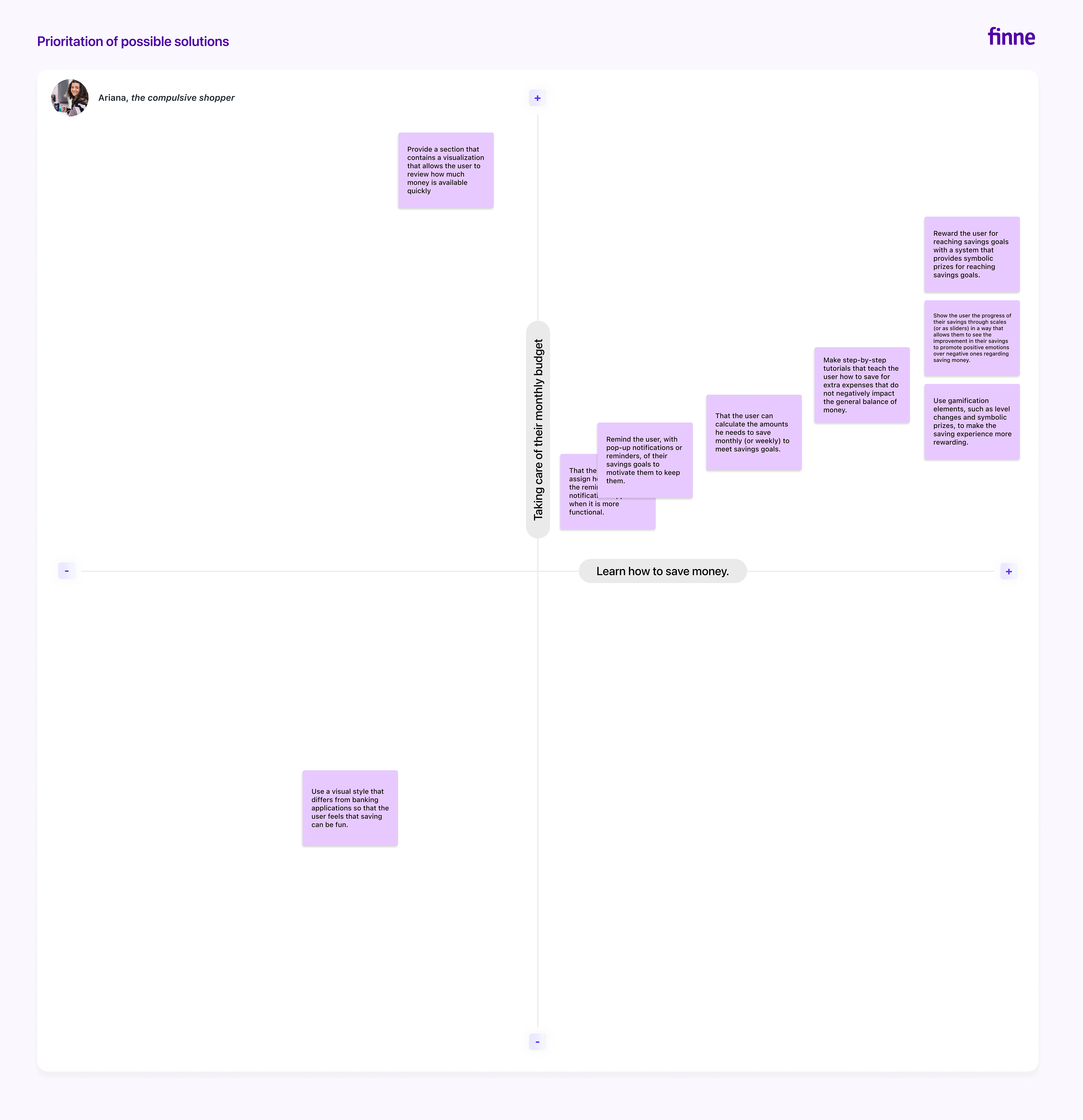
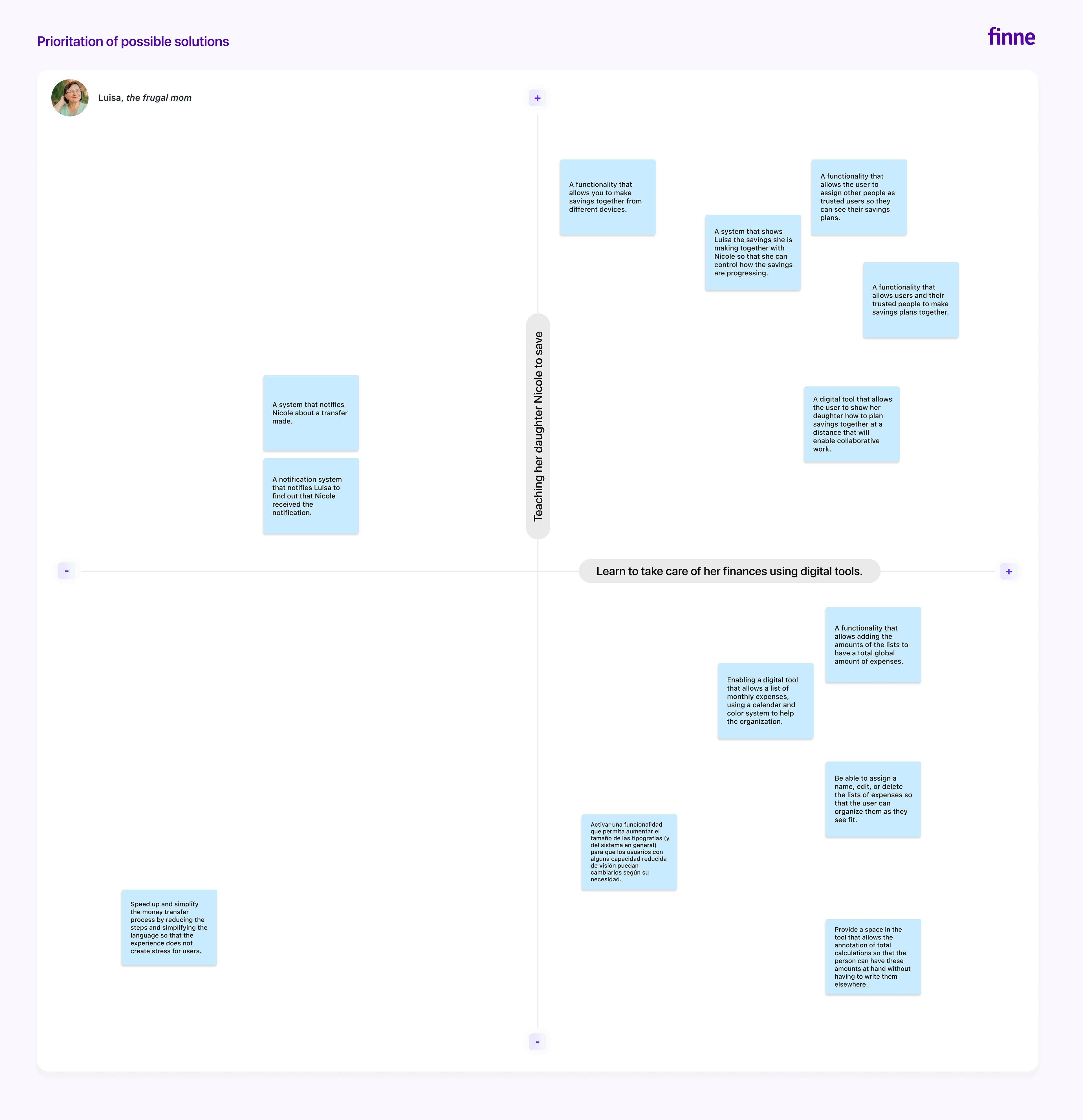
To optimize the user experience and provide the most effective solutions, I have employed a prioritization approach based on the User Journey Maps. Each user's priorities have been utilized as the Cartesian axes to create a prioritization matrix. After this step, I will conduct three surveys tailored to selected user profiles to test functionalities that meet the established priority criteria. The feedback from these surveys will enable me to respond to the users' needs more efficiently.
Validation of improvement opportunities: surveys
I utilized the Google Forms tool to conduct three surveys to gather information about our users' current personal finance practices. Also, I included questions to verify whether the functionalities proposed in this investigation stage meet their actual needs.
From the surveys, I gained the following insights:
Defining the Design Challenge: Restating the Hypothesis
At this point in the investigation, broadening the first hypothesis proposed was vital to encompass important aspects that surfaced during the previous research phase. This will ensure I consider the users' needs, limitations, and potential solutions.
Second Stage: Ideation
Generating Solution Ideas: Brainstorming
The next step is to propose ideas on how the solution to the problems diagnosed in this process will be and how it will function. For this, I conducted a 20-minute brainstorming session to generate as many ideas as possible, allowing creativity to flow without self-judgment.
Once the 20 minutes were up, I grouped the ideas by similarity. As a result, I propose that the tool be a mobile application supported by a web app version so that it can be used from computers or other electronic devices.
Functional and Content Requirements
Taking into consideration the information grouped in the brainstorming exercise, I made a list of functionalities with their possible corresponding content to consider and use as a guide for the project's structure.
Designing Interactions: Structuring the Proposal
Interaction Scenarios and Flows
To structure the proposal, I have drafted four scenarios focused on different situations and users to design possible interaction flows.
To structure the proposal, I have drafted four scenarios focused on different situations and users to design possible interaction flows.
Scenario 1: The user already has an account created and logs in to the application to create their first monthly budget from their mobile device.
Scenario 2: The user has their account but wants to create their first monthly budget and shopping list from their mobile device.
Scenario 3: The user wants to review the payments they have already added to their calendar and add any missing ones from their computer.
Scenario 4: The user already has an account created and logs in to the application to start their first savings goal from their mobile device.
Information Architecture
I created an information architecture based on the previous stages, ensuring that the parts of this architecture are coherent so that the proposed scenarios have the successful functioning that I need to validate the tool. The main sections of this information architecture are the Login/Account Creation, Home Screen, Savings, Planning, and User Profile.
Third stage: Prototyping and testing
Wireframes of medium fidelity
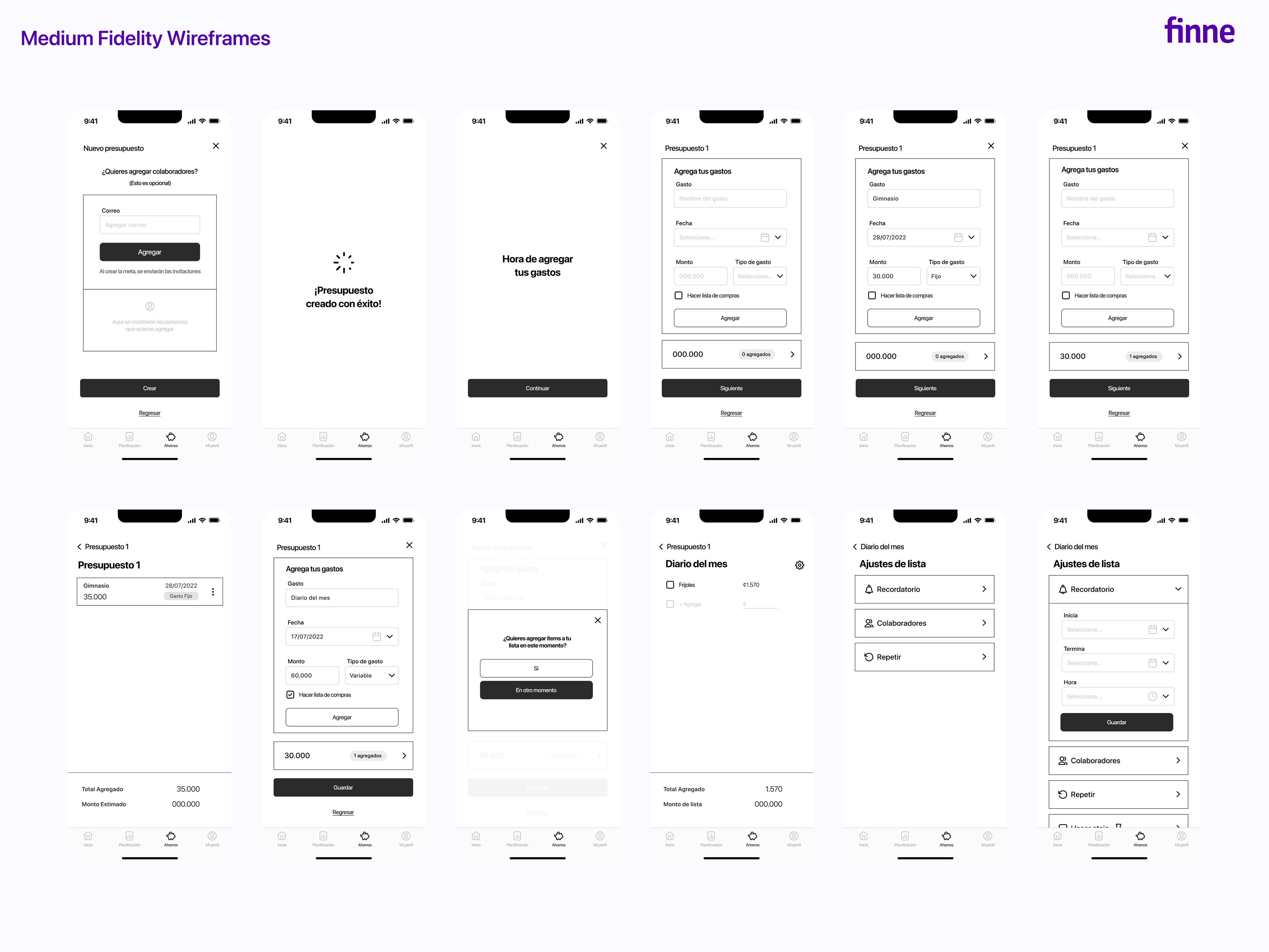
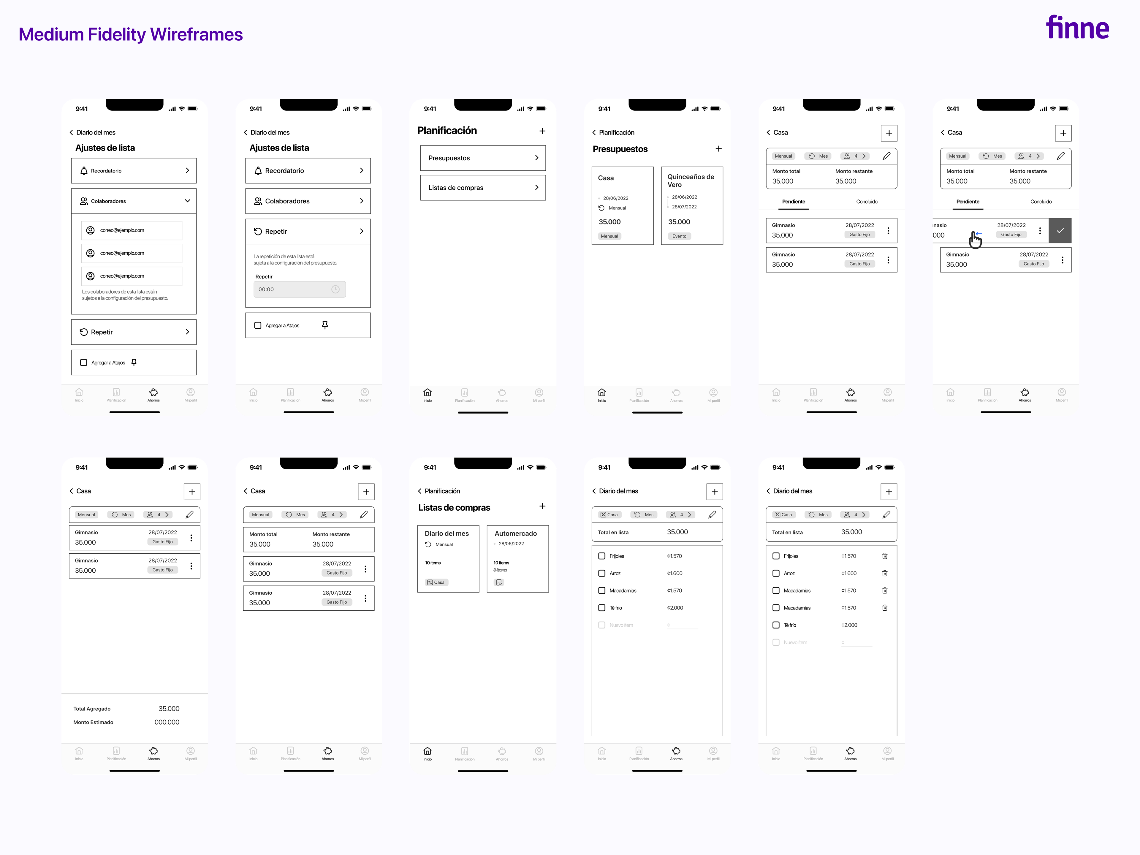
After completing the information architecture, I created medium-fidelity wireframes to sketch out the main screens of the tool, taking into account the functionalities so that these sketches become tools that allow feedback with the information architecture.
Usability testing design
Before creating more complex screen designs, the next step was to plan the scenarios for usability testing and focus on designing the needed screens.
To begin, a general scenario is proposed to contextualize the user testers' roles in the test, let them know how Figma works, and ensure them that they’ll be helping me and the project.
Each scenario will be divided into sub-activities to test specific functionalities to verify if users can use them properly.
Scenario 1
In scenario 1, the interaction with the onboarding is tested, as well as the ability to create shopping lists with limits, edit them, and add collaborators to these lists.
Scenario 2
In the second scenario, the tester will be creating a monthly budget, adding a collaborator, adding new payments to an existing budget, and reactivating a payment archived by mistake are explored.
Scenario 3
In the third scenario, the user will create a savings plan, including adding bonuses and completing savings goals.
Results
I conducted five usability tests; the lowest score was 95%, and the highest was 100%. The user who took the longest to complete the usability test tasks was an older person who liked the tool's functionalities but would need time to learn how to use it 100%.
The most critical changes that emerged from the medium fidelity wireframes were in the Lists, Budget, and Settings sections, always seeking to make the tool's use as understandable as possible and ensure that the user experience is successful and allows users to take advantage of it and improve their finances.
Regarding the lists, I decided to include the date, type of list, number of collaborators, and the list's configuration at the top of the section. Although I initially suggested using a gear icon for the design, user tests revealed that it confused the users. So, I made the necessary changes and put the total amount and spending limit at the bottom of the list to help clarify these functionalities.
The budget section changed similarly to those of specific lists in terms of the header. The Pending and Completed buttons were redesigned for a greater visual hierarchy. At the bottom, I added information on the pending amount to be paid and the total amount, allowing users to switch between them quickly and view the data of interest. To differentiate it from the create button (a plus sign +), I placed the button to add a new payment at the bottom and assigned it a pencil icon labeled "Add."
Fourth Stage: UI Design
USer Interface Design
- Overall, I have enhanced the navbar design to conform to design standards for individuals with visual impairments.
- The designs were crafted based on the Human Interface design guide for iOS devices, ensuring the interface is user-friendly and intuitive.
- To facilitate the readability of the application throughout its functions, I have prioritized using light backgrounds and dark texts. I have refrained from incorporating complex graphics to promote ease of use and ensure users feel comfortable learning about personal finance habits.
- The color palette emphasizes high contrasts and accent colors to optimize visual accessibility and enhance user experience.
To conclude, I designed the UI for a mobile app with ongoing development for a desktop version.
I aimed to create a user-friendly tool as a preliminary step toward learning personal finance planning. I strived to avoid making the application overly complex, making it accessible to users of varying financial knowledge levels.
Thanks for watching!

